Product Discovery
The product discovery was done over several ideation cycles that helped us reach a shared product vision. I used multiple methods and techniques to help us understand real user problems, define business goals, market gaps and product viability.
Design Sprint
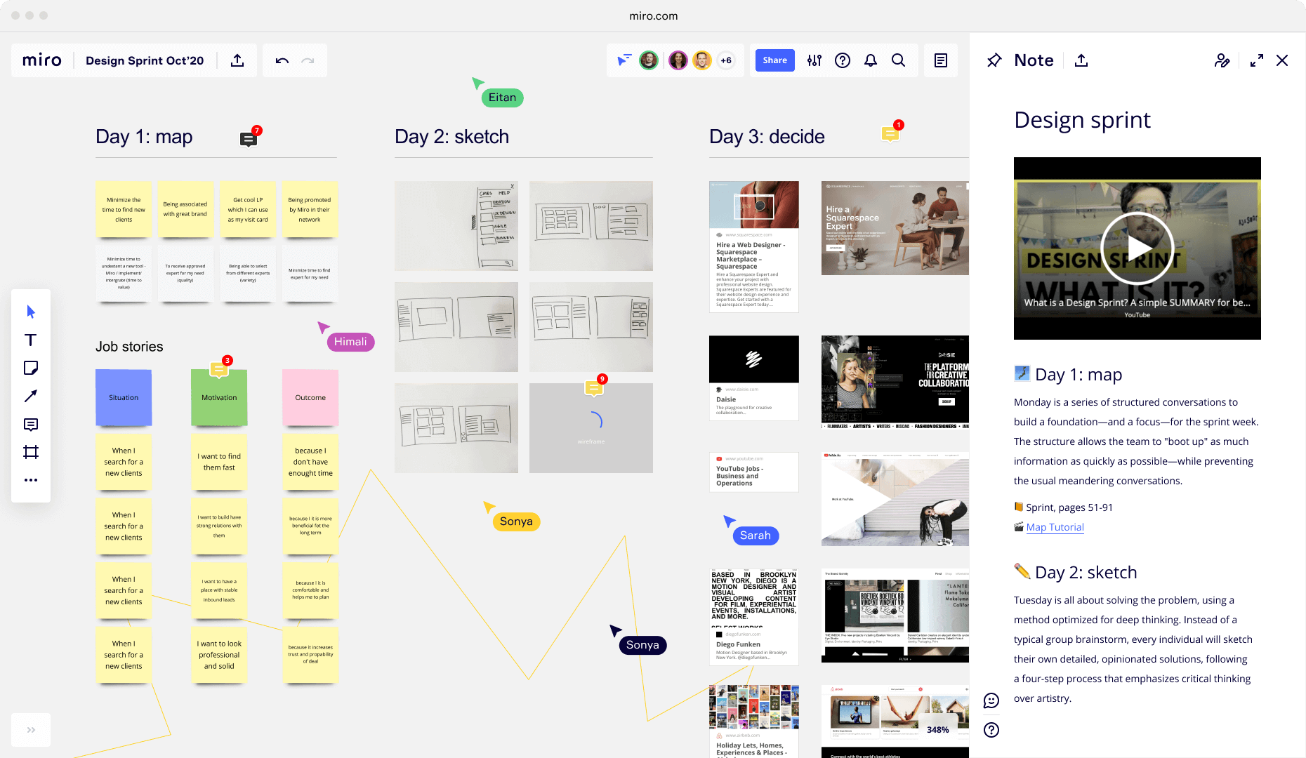
After collecting some initial data, we gathered for a design sprint. This allowed us to focus on specific objectives, test hypotheses and further consolidate our product vision.
Market validation
Having set our product goals I gathered data on market fit and business viability. This allowed us to validate our vision and make adjustments to account for impact vs effort.
Metrics
Objectives & Key Results (OKRs)
After the initial discovery cycle I gathered the data we already had, along with additional measurements and analytics, to help us consolidate data-driven strategies. I relied on OKRs goal-setting methods to guide our product development during the decision-making phase. After launch I also applied the HEART framework to gather user-centred metrics supporting further improvements.
Competitive Analysis
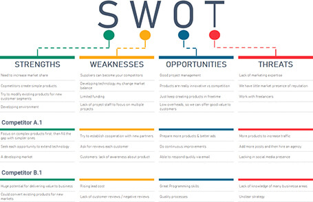
Carrying out a competitor analysis empowers me with actionable insights into market lacks, needs and opportunities. The analysis of both direct and indirect competition, backed by a deep understanding of our goals, allows me to better evaluate what is valuable, usable and feasible.
Prototyping
During the development process, using HTML, CSS and jQuery I created several prototypes to test specific features and needs. The prototypes allowed for proposed solutions to quickly be tested in isolation from the complexity of the entire product. Some of these prototypes were presented to user testing, where I gathered additional data on feature validation and usability.
UX Research
The Newsletter Builder was a B2B SaaS application intended to ease the creation of custom, professional looking newsletters without any programming knowledge required. The system also provides mailing lists management and advanced task automation, among other rich features.
To accomplish these goals, an exceptional intuitive UX was essential in bringing a sense of simplicity to a very complex product.
Customer Discovery
User Segments & Personas
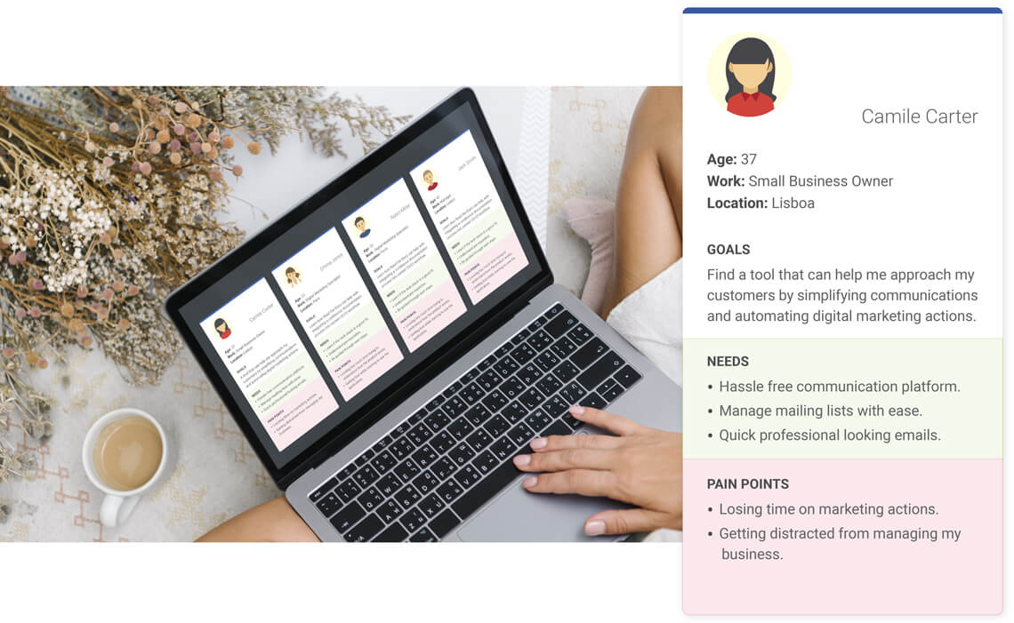
The Newsletter Builder targets businesses that benefit from direct digital marketing. When assessing the most relevant segments I identified two groups: Small business owners and Digital marketing specialists. Then I created personas representative of each segment. This helps me relate to specific goals, needs and pain points in a more humane approach.
User Story Mapping
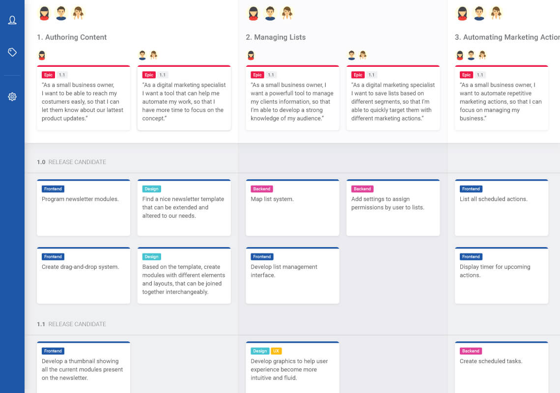
Roadmap
I also used Miro to create our roadmap. The roadmap helped maintain team alignment and output management by keeping focus on feature specification and prioritisation.
Flow Diagram
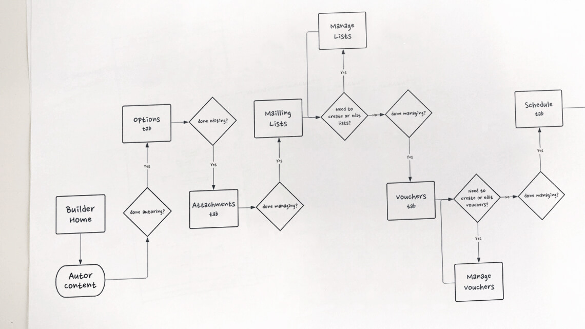
Creating a flow diagram helps the team assess the journey a user will make when using the product. This process might prompt some adjustments, by bringing to light previously unseen problems, and it can help validate the work so far.
Sketches
Final concept
Design System
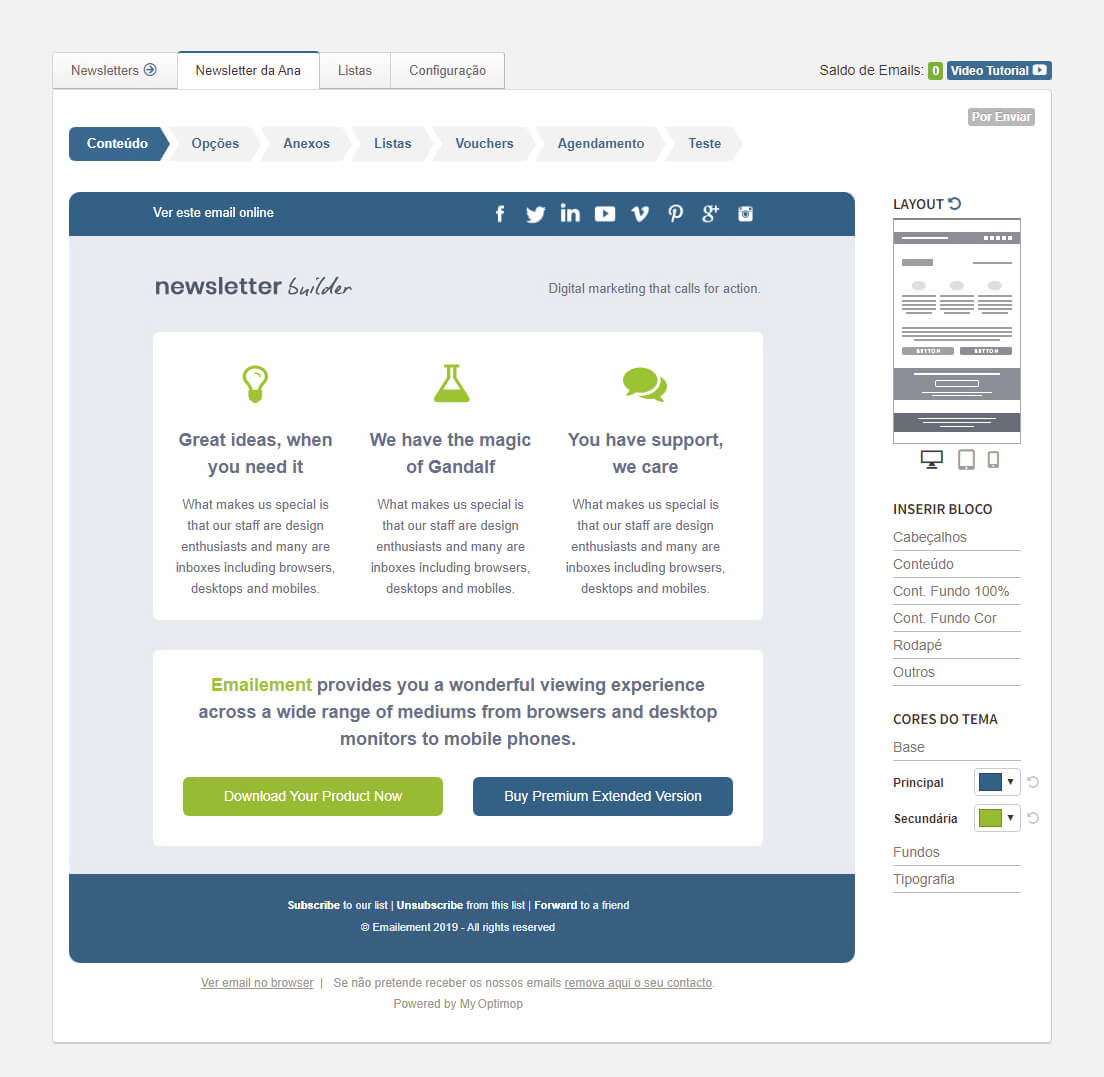
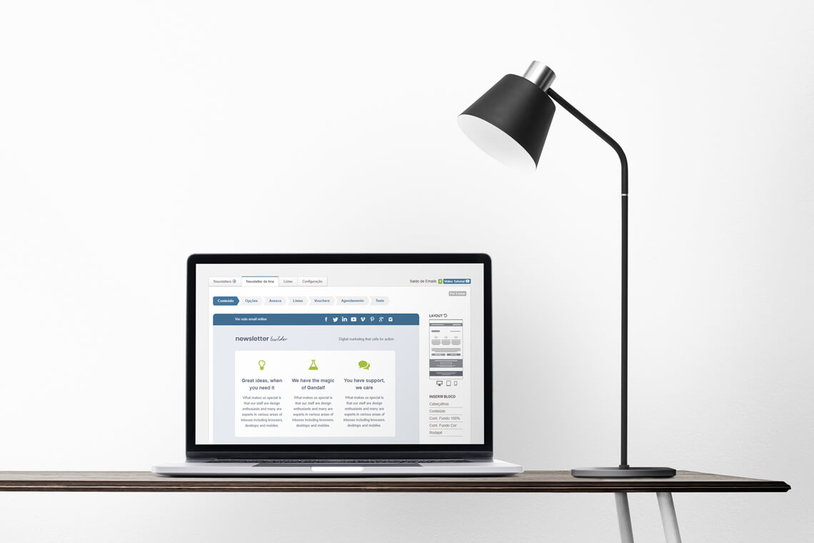
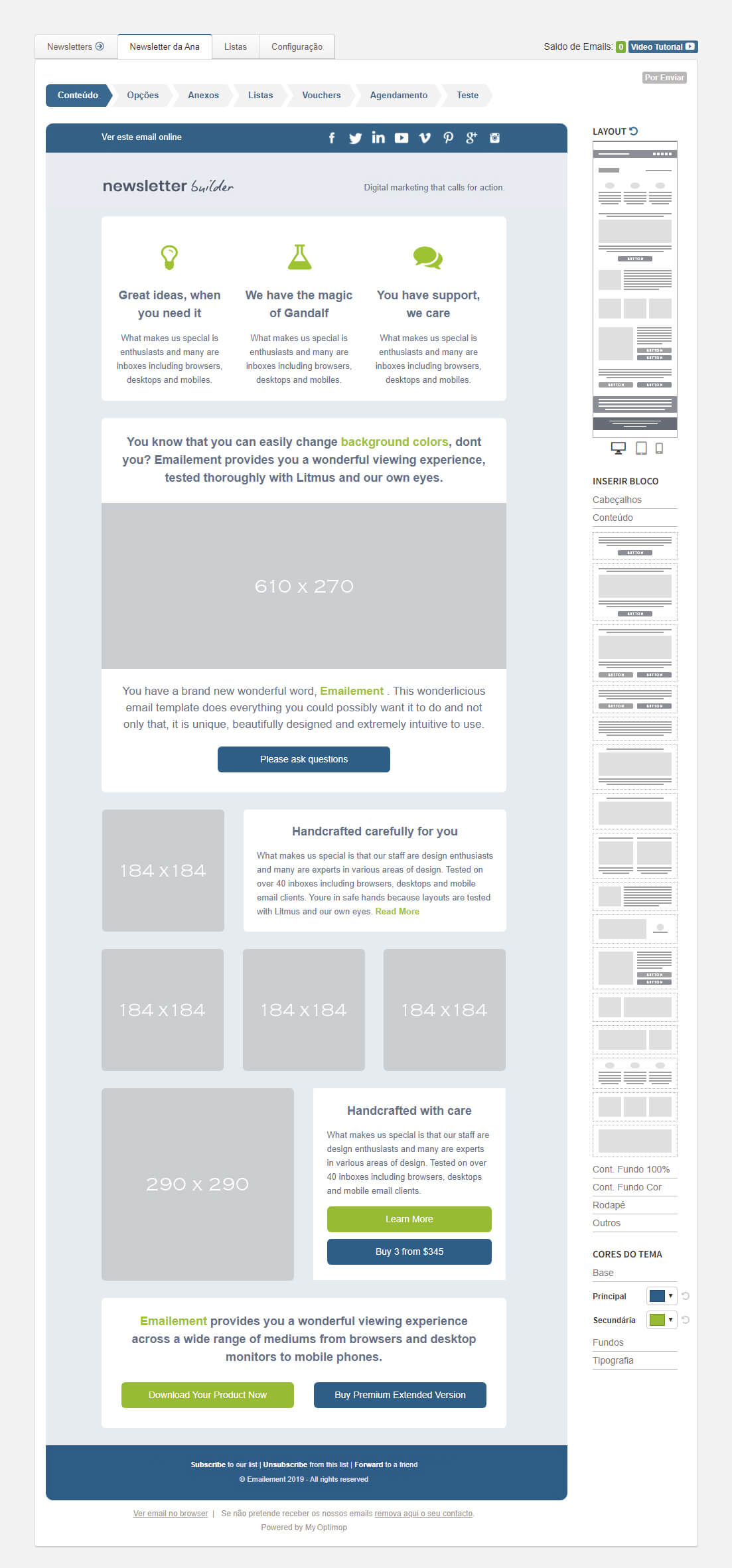
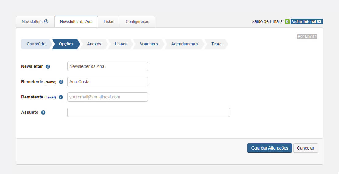
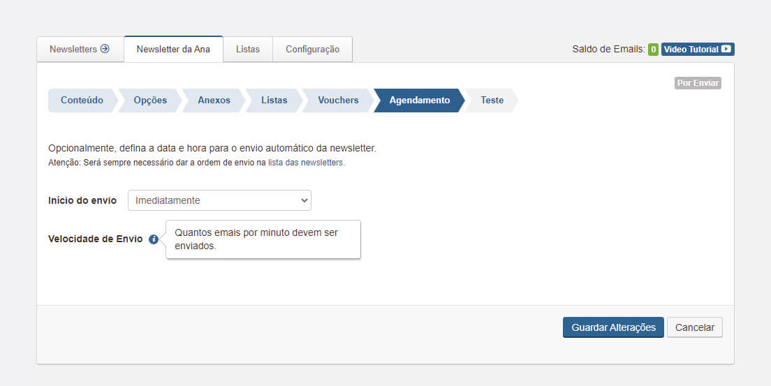
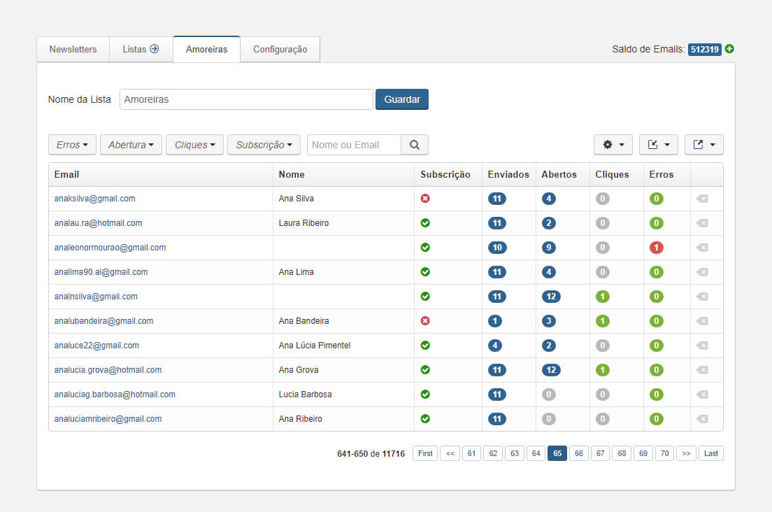
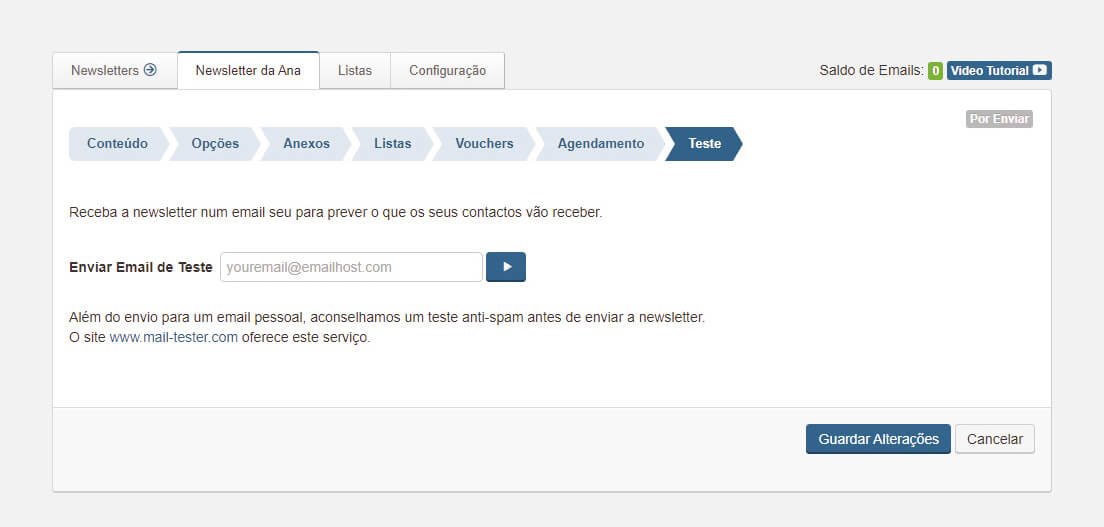
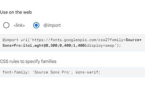
The editor UI and colour scheme are very simple and unobtrusive. The main concerns were clarity, legibility and intuitiveness on the application, while letting the custom newsletter UI shine through.
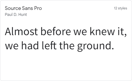
Fonts
Icons
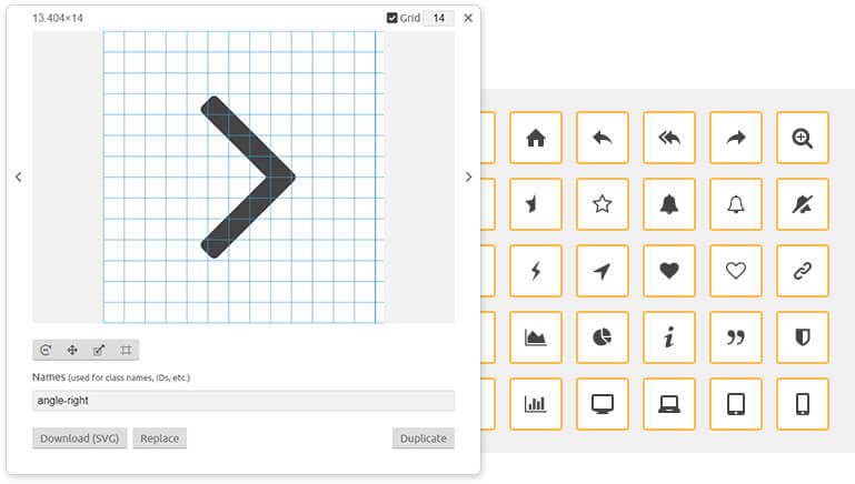
For the icon set we used the Icomoon.io app, which allows the font to be managed by selecting custom icons, and even create or edit individual icons via .svg files.
Special Considerations
Intuitive Design
Providing an intuitive user experience that could offer a sense of simplicity while performing a complex set of actions, was our first priority designing the product.
We started by clearly defining areas for different actions and added stylized graphic elements to aid the fast cerebral thinking process, conveying the flow of the creation process.
Drag & Drop System
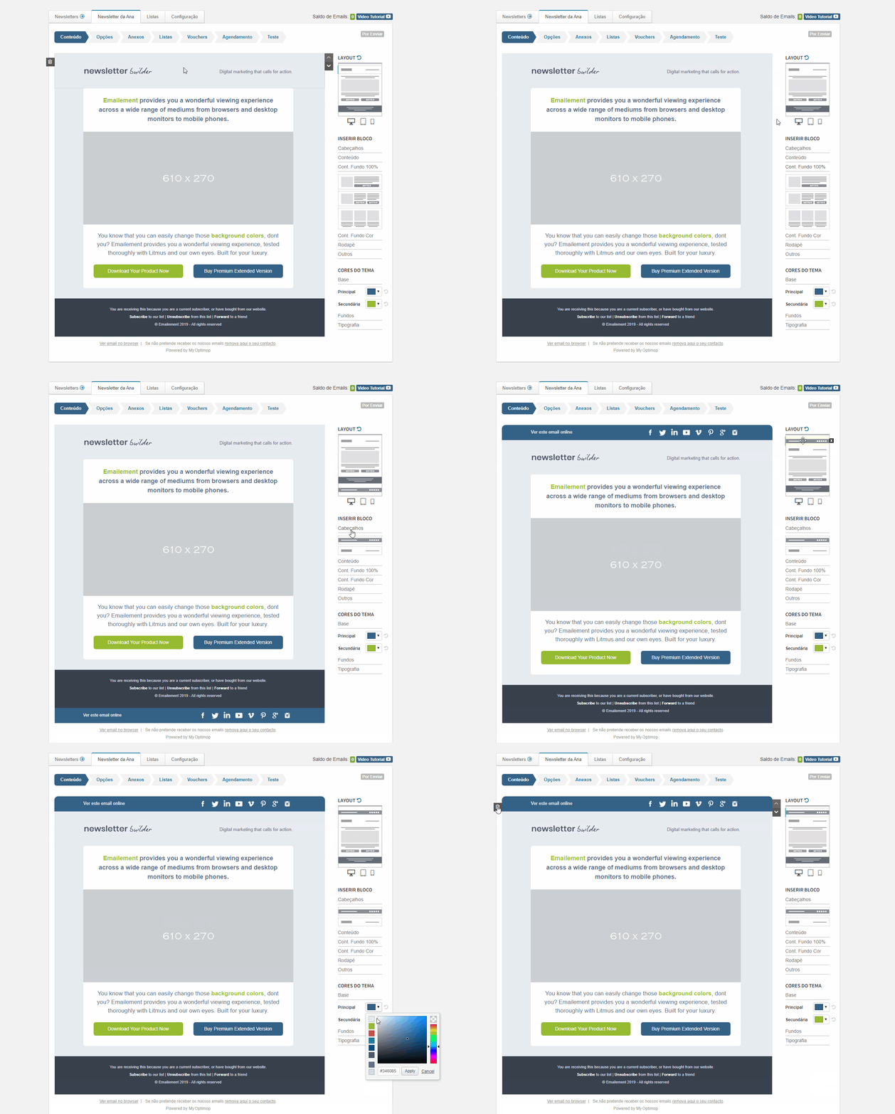
The Drag & Drop System reinforces the intuitive actions of ‘grabbing’ different blocks and moving to the desired place in the newsletter.
Thumb Editor Concept
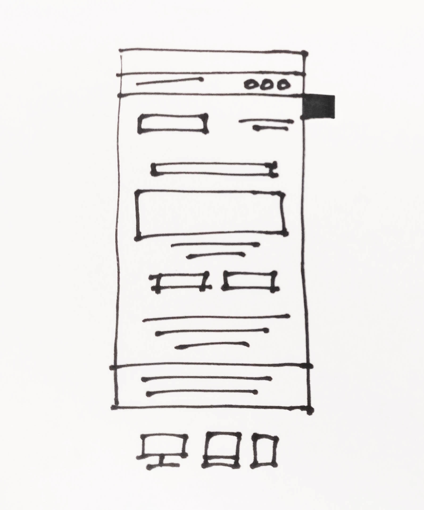
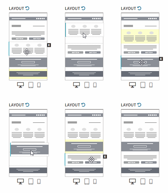
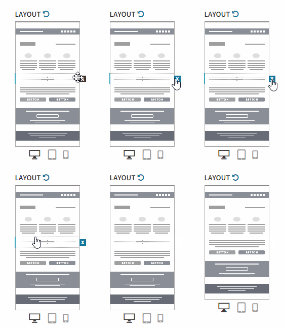
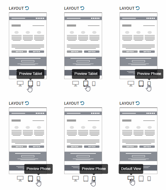
As the newsletter becomes more complex, the full size preview becomes harder to see a full picture of what is happening. This is where the Thumb Editor can be of great help. Every action that can be performed on the full size preview can also be performed on the Thumb Editor, plus, it offers a stylised illustration of the newsletter with all its contents.
Final Thoughts
The development of this product involved a lot of problem solving and creativity when trying to find ways to transform difficult actions into fluid movements, and presenting complex concepts through simple visual tips.
From a subset of different options, resulted the creation of a collection of iconic illustrations representing every newsletter component. Together with other additional solutions, all working to produce a more intuitive experience, we composed an UX rich in stylized graphics, intended for a fast read and easy understanding of the underlying, intricate options, traits and functions.
Unique Challenges
One of the biggest challenges we had was keeping the usage clear and simple, guiding the user through, and not let him be overwhelmed by options. This project was particularly challenging due to its goal of offering many complex features to users with no prior experience and very little time to waste learning or using the app. For this reason, simplification and intuitiveness were prime.
