UX Research
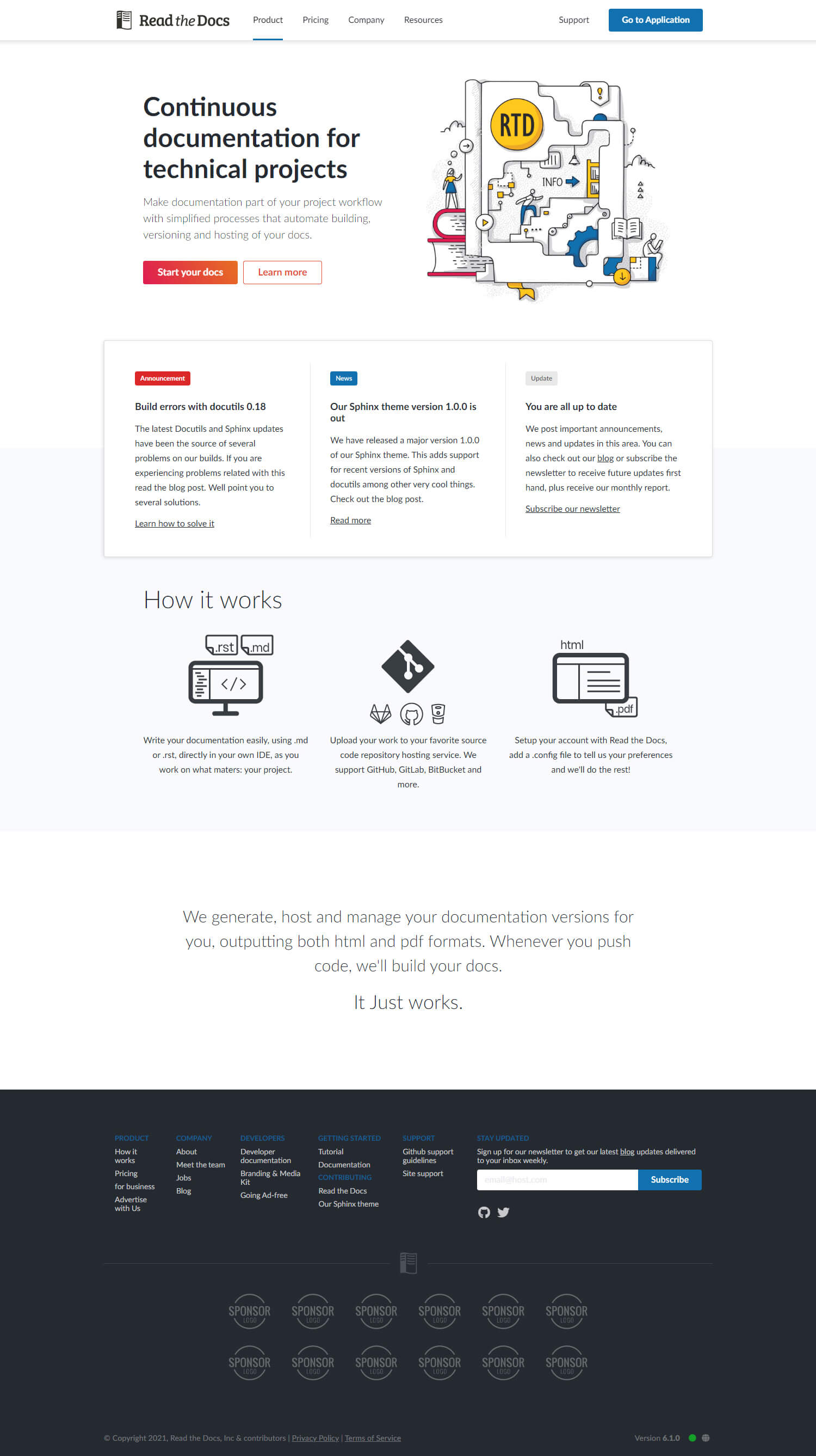
Read the Docs is a very technical and complex product.
One of the main challenges for the UX was improving the product communication to new users, as well as simplifying usage and access to the knowledge base for experienced ones.
The initial research helped define the main user segments, along with their goals, needs and pain points while using the current website. I also did similar research with several competitor products. This helped me establish market gaps and improvement opportunities.
Competitive Analysis
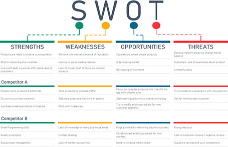
Carrying out a competitor analysis empowers me with actionable insights into market lacks, needs and opportunities. The analysis of both direct and indirect competition, backed by a deep understanding of our goals, allows me to better evaluate what is valuable, usable and feasible.

User Segments & Personas
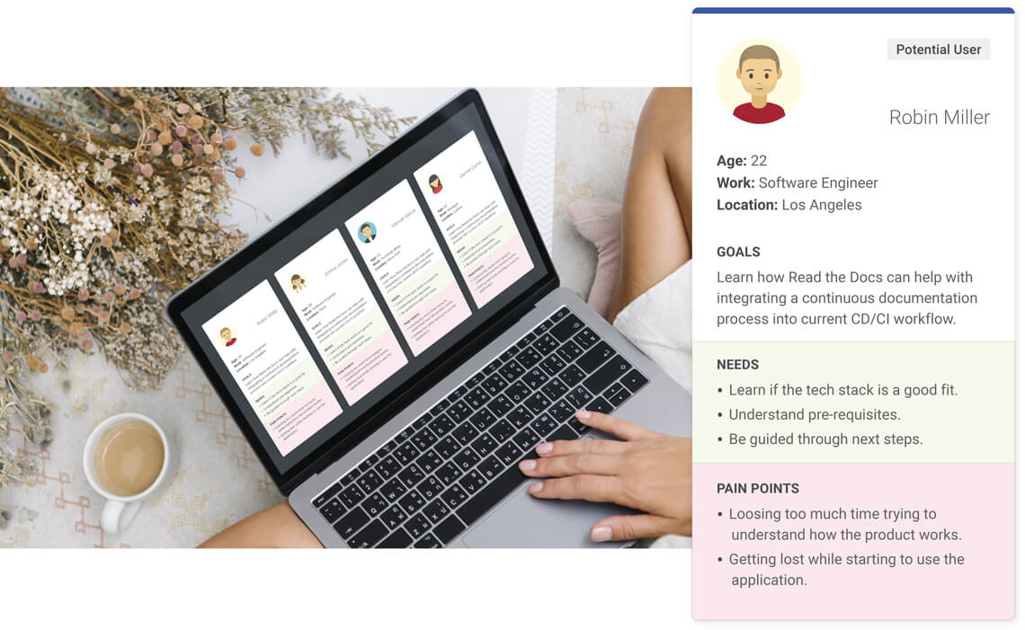
When assessing the target market I started by clearly defining the most relevant user segments. Then I created personas representative of each segment. This helps me relate to specific goals, needs and pain points in a more humane approach.
User Story Mapping
Minimum Viable Product (MVP)
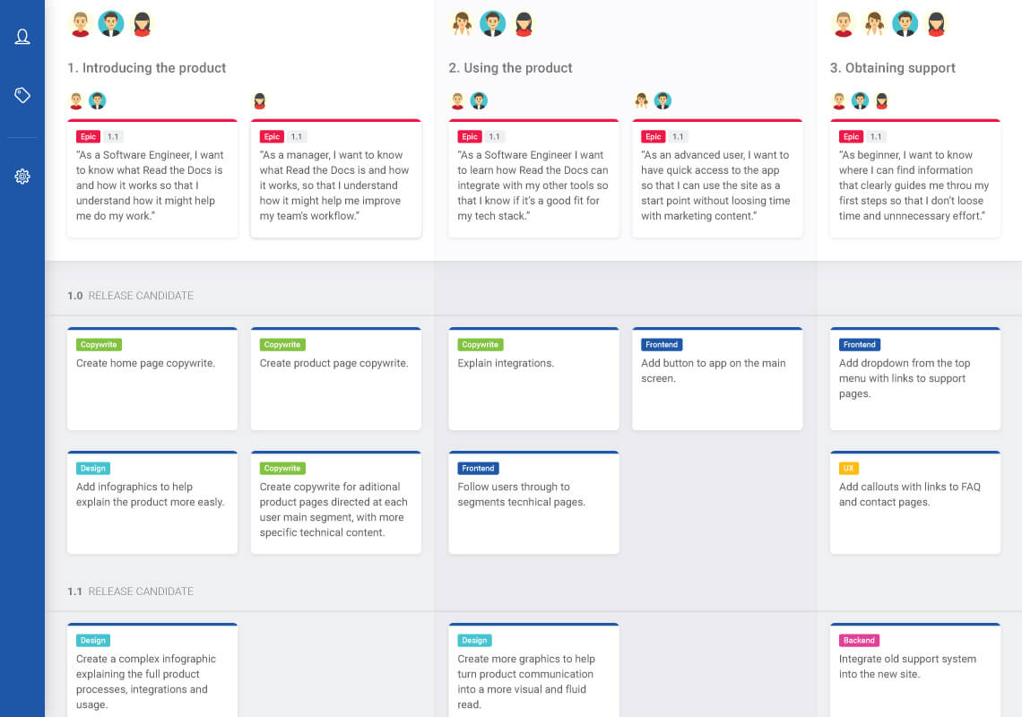
Next, I gathered requirements to define what features I needed. I selected key user stories from my personas and developed a MVP. The MVP would allow me to quickly test the concept in its early stages, addressing any concerns right from the start.
Flow Diagram
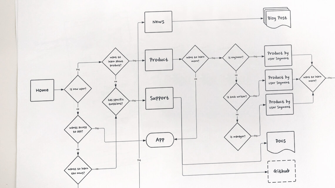
Creating a flow diagram helps me assess the journey a user will make when using the product. This process might prompt me to make adjustments, by bringing to light previously unseen problems, and it can help validate the work so far.
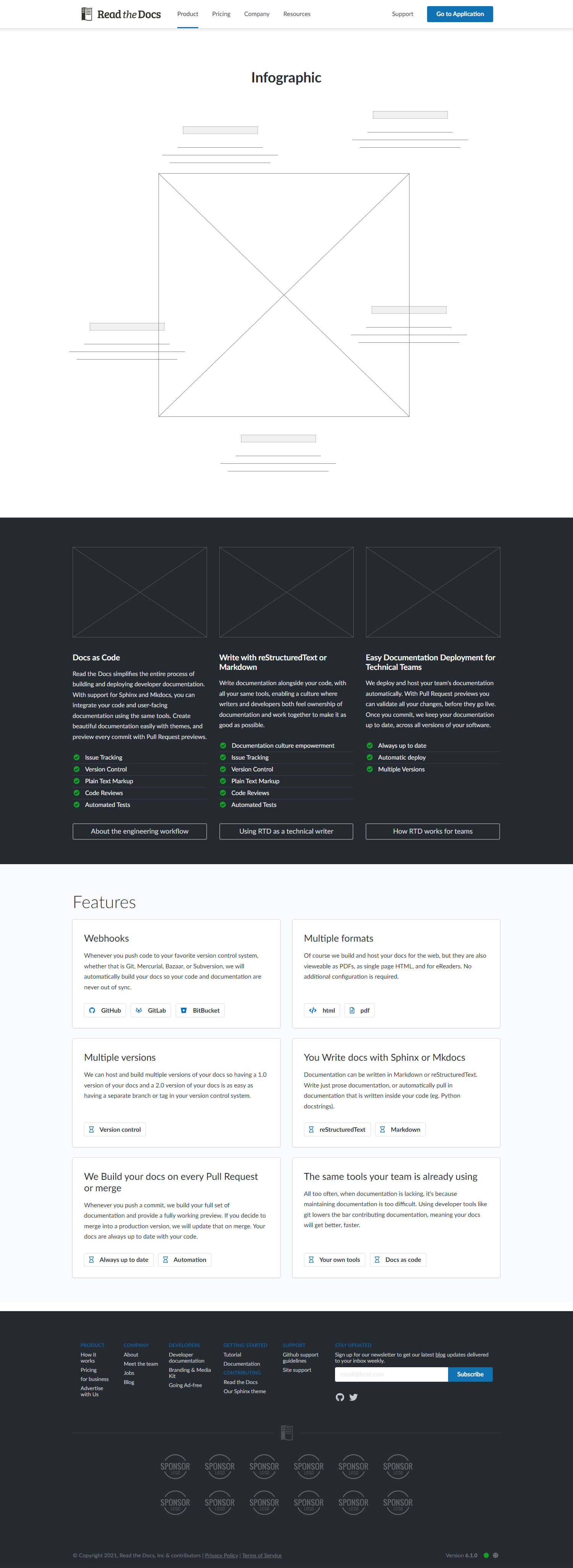
Sketches and wireframes
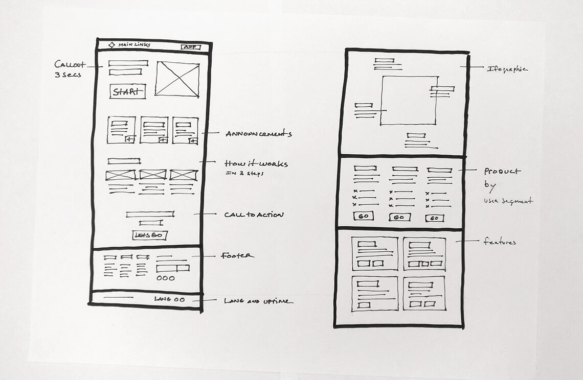
The image on the left was one of the first materials I produced for this project. It depicts a loose wireframing, with multiple notes, that attempt to consolidate our intent for the general messaging and tone.
It also starts to define a user journey for different segments.
Many of the proposed contents were later divided between the home and the product page.
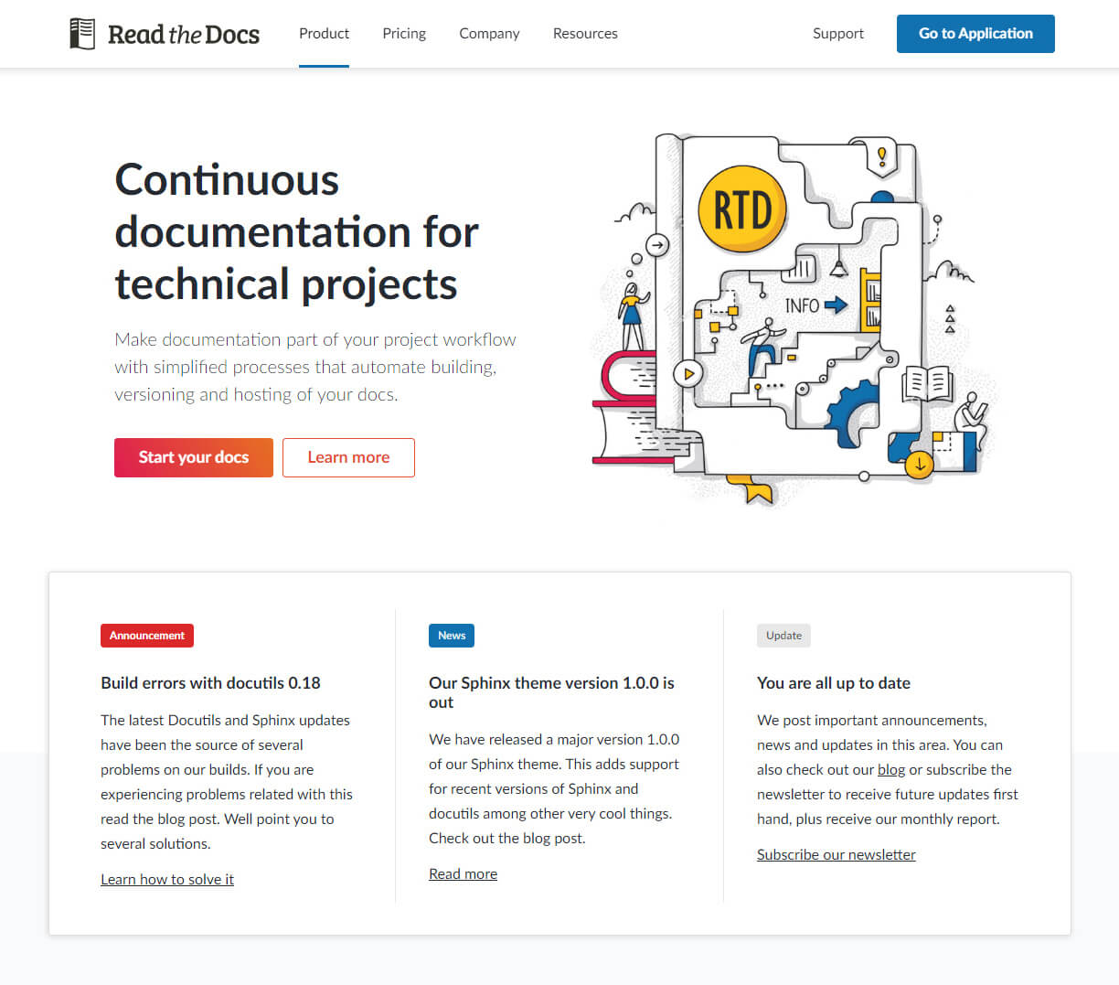
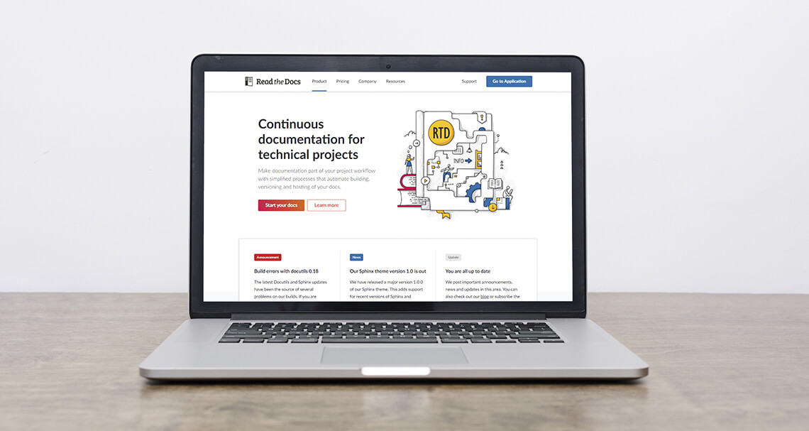
Final concept
Special Considerations
The Community Website was a start point project. Its concept englobed a direct integration with three other projects: the Community App, the Corporate Website and the Corporate App. These projects would be redesigned after the conclusion of the Community Website, with a new concept derived from the first results.
During my initial research and early development, it was established that the four projects should share a strong common identity and easy correlation. To achieve this I proposed they share a common Design System while maintaining individual identities through selected emphatic differences.
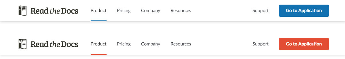
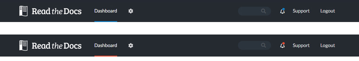
Menu Concept
The top menu is among the first places users look for brand recognition and it was an important element for the new Design System. As a part of our focus to accentuate the correlation between the four related projects we wanted to simplify cross navigation.
Highlights and takeaways
Read the Docs is a very well established product with a high degree of trust and a large user base. Maintaining brand recognition is a must, either when introducing new features or producing changes to old ones.
It’s also an open source project and many of its users are dedicated contributors, participating in the development process on several levels. These circumstances created an unique set of challenges and opportunities that were key in reaching the final results.
Unique Challenges
Additionally, Read the Docs is a very complex product targeting highly technical market segments. The cost of acquiring new users, or of retaining old ones, prioritises product comprehension and ease of use. For potential users, the initial communication is of extreme importance in conveying how the product works and what are its key benefits.
Final Thoughts
My role in this project, both as a UX Designer and Frontend Engineer taught me a lot about collaborating in new environments, using new technologies and about compliance in project management. A big part of the project was developed as open source on GitHub. This allowed me to interact in an open and constructive way, not only with the backend and marketing teams but also with several external contributors, who participated in the discussions, added ideas and enriched the development process.
It was a unique experience that was made more meaningful by all its challenges and by the input of several dedicated professionals from varied backgrounds.